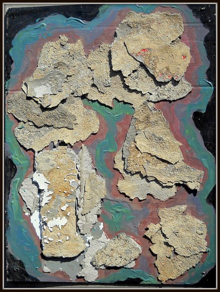
24×18″ Flakes of stucco from the Ox, acrylic on back of a Draino Sign.
Moving pieces around until they seem to slide into place. Three years ago.
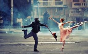
The best scene from Close Encounters of the Third Kind: making that mashed potato mountain on the living room floor. You know there’s something there but have no idea what it is, and no single piece will ever bring it forth, whole and shining with afterbirth. You have to keep doing it. Over and over. Nursing the symptom.
Something had been troubling me–for a few weeks now. I wrote a piece in that mood, posted it… than deleted it (copied and pasted it below). Too raw. To close. I felt flayed. Looking at #417, I began to get it (See what I wrote on that post) –an insight…. a better understanding of what I’m doing when I’m making art.
What follows, is what I posted and deleted.
I may take this down by morning. I’m weaning myself from FaceBook, so this might be the kinda shit I’d post late late at night exhausted mind weary before giving up on the day and surrendering to inebriate dreams.
Though WordPress will post it on FB. Don’t matter. I ain’t there.
I make no pretense, claiming that my obsession with making art is healthy–least of all for me. Like the walking dead say… it is what it is.
I feel a need to link up with others so afflicted. Hard to find. Lotta peeps make art. The more the better! I’m not looking to throw sandbags around some privileged status! But not all who do… are like 19th C. obsessed. Have.. as good as traded their souls for it.
Oh yeah. I did. I gave it up–whatever that was, that soul thing. I said–you can have it. Let me make art. That’s all I want. Sometimes I hear this weird echo laughter… like.. but I’m doing it.
I have no idea what it means to anyone but myself. Whether it’s good or bad–or what good or bad could possibly mean in our time.. when we have no “posterity” to fall back on… living, as we do, at the edge of human self-extinction.
I’d like to think that what I do might lend itself to imagining a better world. But poets are probly better equipped for that–having words at their disposal. Ideas.
I just…like… see stuff. In my dreams. Play with things. Real things. Pieces of trash… arrange them. Or colors, lines. Maybe they look like stuff you see in your world… mostly, probly not.
Useless. I mean… the LAST thing I want, is to be USEFUL in this bloody horrid corporate fascist world! but it does leave me… feeling useless.
I’d like to live in a world where… there was a place for what I do.. for what I have become. I’d like to be able to make that better world visible. But you can’t “intend” that. It has to come from one’s engagement with the world. If you are. It will emerge in your art. Anything you “intend” will only show what already ‘is.’ To body forth what will … what might be… one can only let go.. .and let it happen.
I did… I made this deal with the devil, like I said. You want to be healthy, happy–or make art? If that’s the choice–which will it be? No hesitation. I want to make art. I always have.
Ok, said the devil. Have at it!
Like my mother said. One should always listen to one’s mother.
“Don’t be an artist. Artists are the most selfish people on earth. But if you are… an artist. There’s no hope for you. There’s nothing else you can do.”
Yeah.. .she really did say that to me.
That’s my curse.
and the worst of it… I don’t want to be cured.
I want to reach out to others so cursed… who know themselves damned, as I have been. We could have a lot to talk about.
5×7″ watercolor, ink


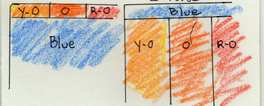
 Two more, playing with colors: Dominant Blue green, with ro, yo and rv for accent.