34×17 building the foundation with palate knife
Month: December 2015
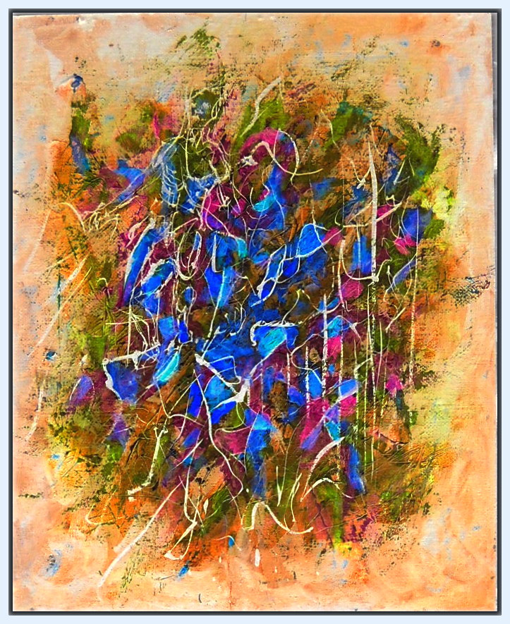
#410 Last of 2015


8×8 watercolor, ink. 115 for the year. Color study for a larger painting.
#409 – with color inversion
View GALLERY HERE.

20×16 Acrylic on wood laminate
Something not right with that orange. While chromatically brighter, it appears darker, when everything else become lighter in tone toward the center.Now look at a color inversion in Picasso. Wow! I should have stared at it in bright light, then painted what I saw when I closed my eyes! I don’t know if it’s a distortion of the digital image, or an optical effect in the painting that makes the orange darker in tone. That can happen, colors aren’t true to themselves, but are altered by the colors around them–in both chroma, and tonality–but the orange in the inversion (now blue), is no longer darker, but lighter.
Now I want to use the color array of the inversion!
Work in progress: Last of 2015

Working on Gallery Pages for My Art
To make it easier to scroll through photos of my art… working on a Gallery Page. I want to have three sections 1: mixed media and assemblages 2: paintings, and 3: pen & ink, water color. drawings & prints. This is just a sampling of work from 2015. Click on an image, and use the arrows to scroll. A better way to see a large selection.
#408

22×10″ Acrylic on canvas
The relatively small size afforded me the opportunity to work out some ideas/techniques–thinking how I like both detail, and where, stepping back, the details merge into a broader design–become simply, elements of texture, which in turn, effects how light traverses the surface. Or reversing the order–I enjoy being able to approach an image, and find that as my eyes focus, closing in, I discover that richness of detail emerge as its own element. I like that two left clicks lets one see the detail–the close up–of these photos. Again–a dialog I’ve been carrying on between my canvases, and the intimate crowquils pen, ink and watercoler pieces.
View GALLERY HERE.
Summoning up the Year.
I looked over the art I’ve posted on my blog. GALLERY HERE.“>
…. and think… not all that bad. Even, ya know… I’m kinda impressed, by the range and variety. And then the anxiety sets in. What have you done today? And what does any of it mean? You make such a passionate fucking BIG DEAL about making this shit… and so what? I mean.. SO WHAT?
Those are my voices.I talk to them… and they, mostly… talk to me. So I have to say… I think it was not such a bad year… so shut the fuck up, and let me get some sleep!
Fat chance.
They will wake three times before the night is over, and tell me how it’s all for nothing. That I’m deluding myself, for the sake of a few seconds of feeling good about what I’m doing. And they… it… whatever… will be sure to set me right several times before dawn.But I’ll get up. And go on. Do you have voices like that? Do you have to deal that shit?
Naked & Ugly. Previously Known As “Reclining Nudes”
Refreshingly brash, intelligent commentary, You don’t have to lose your mind, or turn it off, to appreciate art.
Giorgione did a fine Venus in 1510 (believed to be the first prominent work of the reclining nudes kind), but it was painted not because he wanted the viewer to enjoy the controversial personality of the goddess. It was about her body. A nude woman has always been painted to appeal to men standing in front of the picture. Kings would boast of their lovers to their friends. Noble gentlemen would catch up by exhibiting their hunting trophies: girls they’d bedded and deer they’d killed. If you’ve visited medieval castles, did you notice that “reclining nudes” are often exhibited alongside the stuffed heads of animals?
If the 15th century saw the rise of allegory as justification for painting nude women (of which we remember Botticelli’s Venus and Spring best of all), the 16th century witnessed a tidal wave of Venuses, Dianas, and Paris Judgements. I’ll skip the rest of the…
View original post 791 more words
#407 Where We All Must Go

18×24″ Acrylic, canvas strips on press board
I’ve done little more since (W.I.P. HERE) than bring out the drawing of the figure under the canvas cut-out… and added stars.
… then after posting this, I see those white points–and white of the strips, as too harsh–so much, that one doesn’t notice that some of the points are yellow, and some red. So brushed on a very thin glaze of Phthalo blue (PB 15).Will have to wait till morning and daylight take another photo to replace this one.
View GALLERY HERE.
Music for the end of our time on this planet…
Great music always reminds me… this is the end of the world. Goes back to the Cuban Missile Crisis… a concert, Bach’s unaccompanied sonatas … realizing, as I listened… that it meant nothing. It was all for nothing. All the music… all the art of the world… that it meant nothing…and so achingly beautiful.
Great art.. always telling us this… the same message.
All for nothing. And nothing else matters…
I like the very different Henryk Szeryng rendering… but this is something new… I love the aggressive attack–as Menuhin gave a touch of Jewish Klezmor–there’s something of Bartok in this… a kind of Roma vigor. I really LOVE it… though Szeryng is unsurpassed in drawing out the polyphonic voices… like two violins not just one.
