View GALLERY HERE.


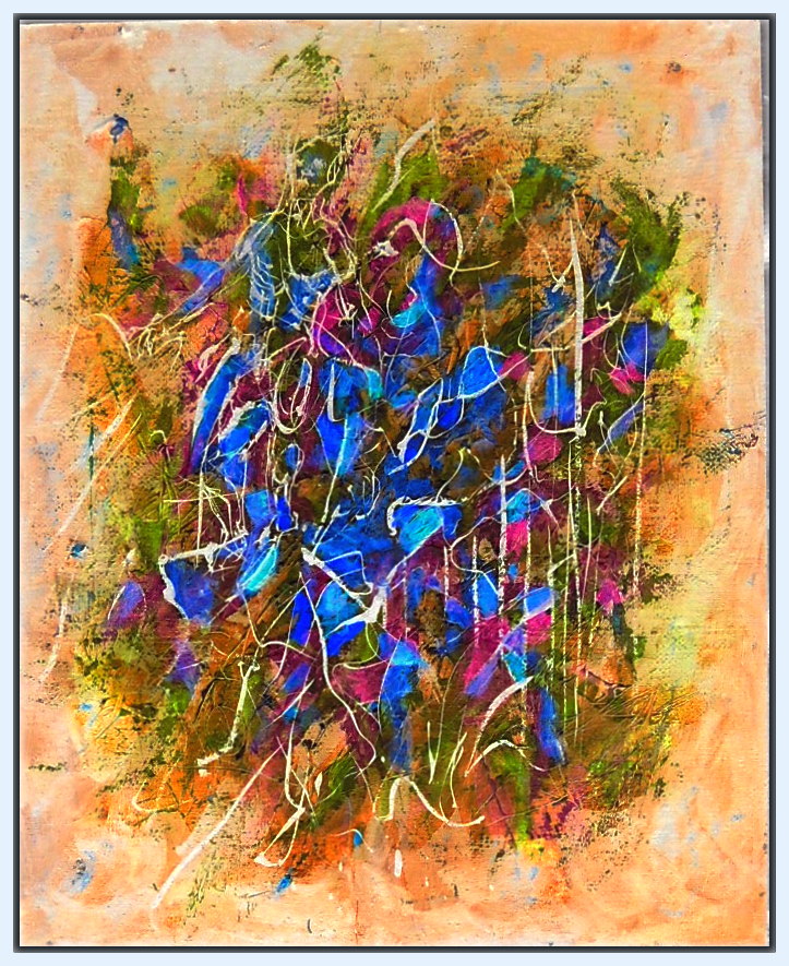
20×16 Acrylic on wood laminate
Something not right with that orange. While chromatically brighter, it appears darker, when everything else become lighter in tone toward the center.Now look at a color inversion in Picasso. Wow! I should have stared at it in bright light, then painted what I saw when I closed my eyes! I don’t know if it’s a distortion of the digital image, or an optical effect in the painting that makes the orange darker in tone. That can happen, colors aren’t true to themselves, but are altered by the colors around them–in both chroma, and tonality–but the orange in the inversion (now blue), is no longer darker, but lighter.
Now I want to use the color array of the inversion!