
Doesn’t look bad matted! OMG, I love the vibrancy of water colors! Sitting over my drawing table, they just sing! I think I will be spending more time with water colors — perfect antidote to winter blahs!
Doesn’t look bad matted! OMG, I love the vibrancy of water colors! Sitting over my drawing table, they just sing! I think I will be spending more time with water colors — perfect antidote to winter blahs!
Working with dominant/subordinate field reversal, where I wanted yellow orange and red for the dominant field, and blue as the accent. An attempt with acrylic was a failure. MUCH easier the other way around, where the warm colors are the accents and blue is the dominant field. I got a nice sheet of Fabriano 140 lb cp yesterday. Cut it up for 5×7 and 8×10 pieces, leaving myself 5 6×3 pieces and a 22″ strip for testing color swatches and combinations.
Here are two… still a difficult combination (though pretty close to what I have in #412) Need to think carefully about the design. And I can’t use red the way I would in acrylic or oil…tends to pink with water color. I could use it dry, almost impasto, in tiny spots, I suppose. Here are two of the 3×6 trials. I’ve posed a problem for myself… think I need to dream on this!

[…] it is usually through artistic expression that the highest values acquire permanent significance and the force which moves mankind. Art has a limitless power of converting the human soul—a power which the Greeks called pyschagogia. For art alone possesses the two essentials of educational influence—universal significance and immediate appeal. By uniting these two methods of influencing the mind, it surpasses both philosophical thought and actual life. Life has immediate appeal, but the events of life lack universal significance: they have too many accidental accompaniments to create a truly deep and lasting impression on the soul. Philosophy and abstract thought do attain to universal significance: they deal with the essence of things; yet they affect none but the man who can use his own experience to inspire them with the vividness and intensity of personal life. Thus, poetry has the advantage over both the universal teachings of abstract reason…
View original post 48 more words
What I have in mind: each piece with 4 hue scheme in 4 variations
Let A be point One on color wheel, B it’s compliment, C-D split compliments
1. A = Dominant, B,C,D subordinates
2. B,C,D Dominant, A subordinates
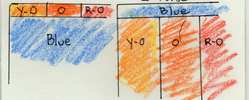
Each of these with its inverse for each chroma. Theme and variation.
For 1, if A= Blue B, C and D would be Orange, Yellow orange and Red orange respectively,
with A Dominant and B C D subordinates
Inverse would be Orange=Dominant, with Blue, Blue-violet and Blue-green as subordinates.
Tone and chroma would vary as I might see fit.
Due to some initial confusion on how Windows 10 handles photos, I accidentally deleted all the photos on Magic Names, more than 500 of them–some 300 or more photos of my art. I’ve begun to restore them, but it’s a slow, tedious process. As of January 12, I have everything I’d posted since September, 2015, and will add more each day as I have time. For now… here’s what’s up: — https://jacobrussellsmagicnames.com/category/my-art/
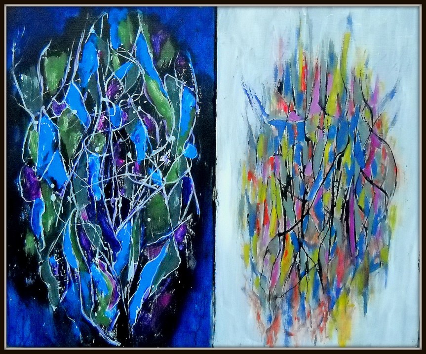
24×30″ Acrylic on press board. Color study. Left panel, inverse color and tone of right panel

View GALLERY HERE.
This article made me think, how the material reality of the house where I live (I’m remembering the Ox, the communal warehouse where I lived) shapes our lives in ways that are beyond what we intend or choose. The material reality we make or choose, makes us. This made me think of our kitchen. My increasing dissatisfaction with how we use it. Our shared and progressively less shared and more individually fragmented kitchen–how the physical kitchen, by it’s small size, its limited storage, shapes this fragmentation into a less and less communal space. In the Ox, a dozen people could work, sit around and schmooze, clean up and cook, all in the same room. The huge work table and ample space not only made this possible, but it invited it, and the space of the Ox itself–a space with its many rooms and open areas, good for music and hanging out, needed to be filled–and that in turn, required a degree of cooperative action for cleaning and care–which when resisted, made us (FORCED us!) to be aware (to different degrees) of our mutual dependence (and how unready we were for this, having come from the dominant culture) in ways that living in an apartment, didn’t. Living in a house divided like this–like most middle and working class housing– people can comfortably settle into their habitual, individuated lives; can see in this how a shared house, arranged for isolated non-extended ‘family’ units–needs a high degree awareness–and experience with more communal living–to resist being re-formed into something closer to the cultural norm–the divided and alienated consciousness suitable for capitalist exploitation.
My way to Speculative Realism was through Harman’s was through Harman’s Prince of Networks: Bruno Latour and Metaphysics. It’s difficult, after all these years, to convey the sense of excitement I felt when reading this book. I had felt it before, my first year of graduate school when reading Zizek’s Sublime Object of Ideology (I actually dreamed about that book). There I felt as if an entire opaque world of theory opened up to me that both allowed me to understand the thought of figures such as Lacan but, more importantly, that allowed me to put that theory to work and comprehend the world around me. Harman, of course, is a consummate stylist. There is a certain charm and style to his writing that is difficult to put your finger on. Often it occurs in the margins, when the reader comes across offhand asides that he makes such as…
View original post 1,379 more words
To make it easier to scroll through photos of my art… working on a Gallery Page. I want to have three sections 1: mixed media and assemblages 2: paintings, and 3: pen & ink, water color. drawings & prints. This is just a sampling of work from 2015. Click on an image, and use the arrows to scroll. A better way to see a large selection.

22×10″ Acrylic on canvas
The relatively small size afforded me the opportunity to work out some ideas/techniques–thinking how I like both detail, and where, stepping back, the details merge into a broader design–become simply, elements of texture, which in turn, effects how light traverses the surface. Or reversing the order–I enjoy being able to approach an image, and find that as my eyes focus, closing in, I discover that richness of detail emerge as its own element. I like that two left clicks lets one see the detail–the close up–of these photos. Again–a dialog I’ve been carrying on between my canvases, and the intimate crowquils pen, ink and watercoler pieces.
View GALLERY HERE.
