

View GALLERY HERE.
5×7 watercolor. This is on the reverse side of #425
5×7″ watercolor, ink
Water colors are fragile. Even with high quality pigments and all cotton paper, they require special care: store away from direct sun, florescent lights, or too bright light of any kind. They need to be matted with non-wood pulp, acid free board and kept behind glass, with mats of sufficient thickness to leave air space between the paper and glass. There are other treatments–covering with resin, but I doubt if conservators would recommend them.
But then, we are at the end of human habitation on this planet (or any other), so who needs to consider ‘posterity?’ Let fragility be a virtue. Let our art perish with us–they’ll be no one to enjoy it when we’re gone. Let it feed the rats and roaches that survive us!

Playing with colors. Each an approximate inversion of the other in hue and tone. #222, ink and water color. Continuing my exploration of what I can do with water color… a medium I’ve not more than dipped into… but finding I love … being in love with color, how could I not be? Like being a student! Would I have been able to do this in a water color class? Maybe Debi Riley’s! Check out her blog–beautiful work, and a natural teacher.
If it’s not play… if it stops being play… get a job at something that pays.
View GALLERY HERE.
 Two more, playing with colors: Dominant Blue green, with ro, yo and rv for accent.
#220 got a little muddy. Gotta keep ’em fresh!
6×3″ water color

View GALLERY HERE.
In the 60’s I bought a pad of drawing paper, cream colored, clay coated. I believe it was Morilla Cameo, a paper that was used for silver point. I’ve never found anything before or since as wonderfully responsive to pencil… or to fine ink. You could use pencil as you would use a fine pen nib with ink… with all the shading and modulating power of pencil.
Here are two drawings, the first, from 1969 (crow quill), the second, from 1970 (pencil). I’ve searched in vain trying to find paper like this. If you know where I might find it, please let me know.
Post script: my suspicions were right-that this paper was intended for SilverPoint. Here’s a wonderful site with information on technique, materials and contemporary silverpoint artists.

 x
x

Doesn’t look bad matted! OMG, I love the vibrancy of water colors! Sitting over my drawing table, they just sing! I think I will be spending more time with water colors — perfect antidote to winter blahs!
Working with dominant/subordinate field reversal, where I wanted yellow orange and red for the dominant field, and blue as the accent. An attempt with acrylic was a failure. MUCH easier the other way around, where the warm colors are the accents and blue is the dominant field. I got a nice sheet of Fabriano 140 lb cp yesterday. Cut it up for 5×7 and 8×10 pieces, leaving myself 5 6×3 pieces and a 22″ strip for testing color swatches and combinations.
Here are two… still a difficult combination (though pretty close to what I have in #412) Need to think carefully about the design. And I can’t use red the way I would in acrylic or oil…tends to pink with water color. I could use it dry, almost impasto, in tiny spots, I suppose. Here are two of the 3×6 trials. I’ve posed a problem for myself… think I need to dream on this!


24×18″ Flakes of stucco from the Ox, acrylic on back of a Draino Sign.
Moving pieces around until they seem to slide into place. Three years ago.The best scene from Close Encounters of the Third Kind: making that mashed potato mountain on the living room floor. You know there’s something there but have no idea what it is, and no single piece will ever bring it forth, whole and shining with afterbirth. You have to keep doing it. Over and over. Nursing the symptom.
Something had been troubling me–for a few weeks now. I wrote a piece in that mood, posted it… than deleted it (copied and pasted it below). Too raw. To close. I felt flayed. Looking at #417, I began to get it (See what I wrote on that post) –an insight…. a better understanding of what I’m doing when I’m making art.
What follows, is what I posted and deleted.
I may take this down by morning. I’m weaning myself from FaceBook, so this might be the kinda shit I’d post late late at night exhausted mind weary before giving up on the day and surrendering to inebriate dreams.
Though WordPress will post it on FB. Don’t matter. I ain’t there.
I make no pretense, claiming that my obsession with making art is healthy–least of all for me. Like the walking dead say… it is what it is.
I feel a need to link up with others so afflicted. Hard to find. Lotta peeps make art. The more the better! I’m not looking to throw sandbags around some privileged status! But not all who do… are like 19th C. obsessed. Have.. as good as traded their souls for it.
Oh yeah. I did. I gave it up–whatever that was, that soul thing. I said–you can have it. Let me make art. That’s all I want. Sometimes I hear this weird echo laughter… like.. but I’m doing it.
I have no idea what it means to anyone but myself. Whether it’s good or bad–or what good or bad could possibly mean in our time.. when we have no “posterity” to fall back on… living, as we do, at the edge of human self-extinction.
I’d like to think that what I do might lend itself to imagining a better world. But poets are probly better equipped for that–having words at their disposal. Ideas.
I just…like… see stuff. In my dreams. Play with things. Real things. Pieces of trash… arrange them. Or colors, lines. Maybe they look like stuff you see in your world… mostly, probly not.
Useless. I mean… the LAST thing I want, is to be USEFUL in this bloody horrid corporate fascist world! but it does leave me… feeling useless.
I’d like to live in a world where… there was a place for what I do.. for what I have become. I’d like to be able to make that better world visible. But you can’t “intend” that. It has to come from one’s engagement with the world. If you are. It will emerge in your art. Anything you “intend” will only show what already ‘is.’ To body forth what will … what might be… one can only let go.. .and let it happen.
I did… I made this deal with the devil, like I said. You want to be healthy, happy–or make art? If that’s the choice–which will it be? No hesitation. I want to make art. I always have.
Ok, said the devil. Have at it!
Like my mother said. One should always listen to one’s mother.
“Don’t be an artist. Artists are the most selfish people on earth. But if you are… an artist. There’s no hope for you. There’s nothing else you can do.”
Yeah.. .she really did say that to me.
That’s my curse.
and the worst of it… I don’t want to be cured.
I want to reach out to others so cursed… who know themselves damned, as I have been. We could have a lot to talk about.
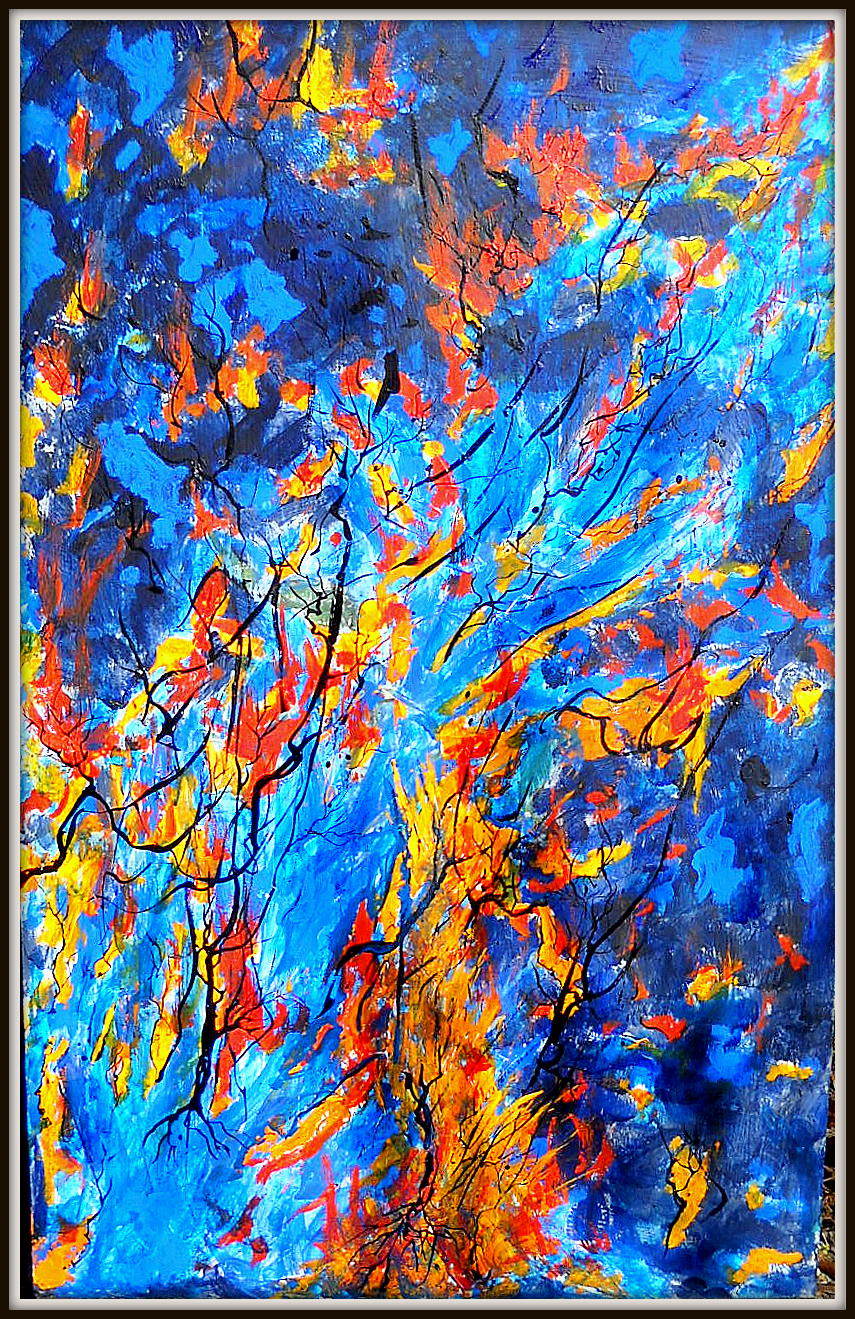
View GALLERY HERE.
24×18″ Acrylic on scrap pressboard. Why… with blue dominant, didn’t I choose a horizontal and pacific design? I don’t know…. and yet….
… I look at this again, as something in a dream, or an image–not even an image, but movement. Remember when you were a child, watching runoff along the curb after a rain? Imaging yourself watching a great river from space, a deluge slicing through continents. Is it that these patterns are there in our unconscious, so when we think we are working with abstract, non-figurative visual ideas, we are mapping those patterns, and the degree of satisfaction we feel as we work derives from how close we have come to those unconscious patterns? Before we had words for what we saw, images–moving, always moving–crossed our fields of vision, without names, without the burden of language–or rather, with a language more primal than words?
How can it ever be irrelevant–to map what is hidden–to what actually drives our actions? We give so much credit to consciousness–to conscious will, when it’s no more that a pipping bird on the back of a Rhinoceros.
 … and then you die
