#413

#413

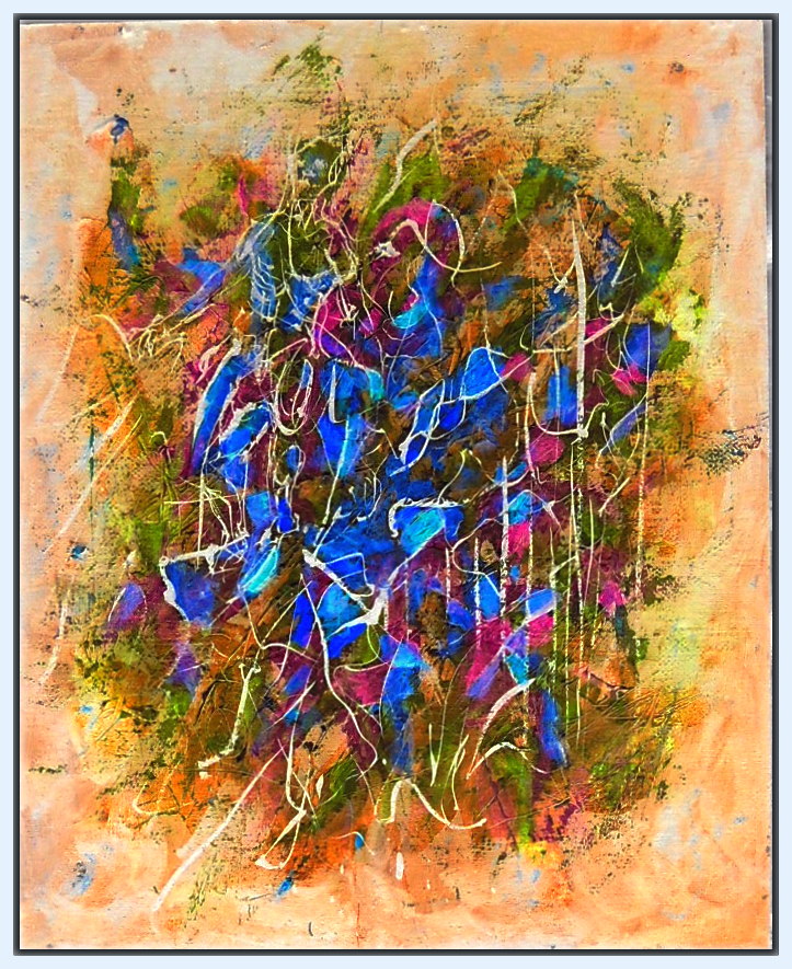
33×41″ (including frame) Acrylic on press board–painted over a flea market reproduction. What I do when I don’t have the $100-150 for 2 or 3 yards of canvas and stretchers–find paintings and reproductions in flea markets or thrift stores to paint over. Anything that the paint will stick to and not peel off. And if wood, and I can glue and nail things on, all the better.

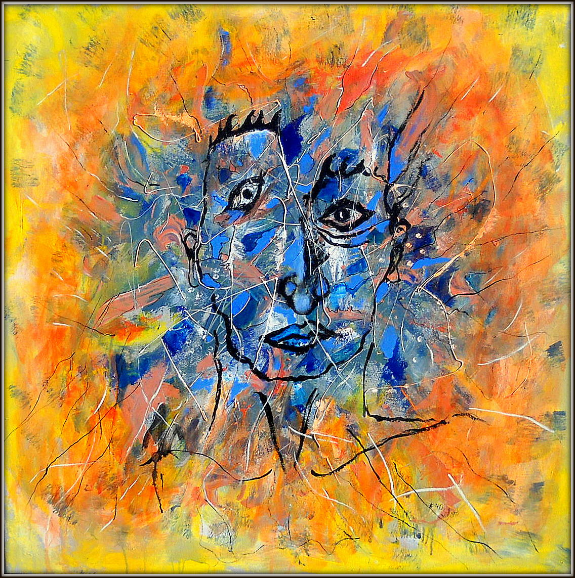
Here, using compliments and split compliments (violet, red-violet and blue-violet)  to intensify the yellow. Color as light and color as pigments play with our perception: compliments in balance are dissonant, giving your eyes no rest–like flashing Xmas lights (red & green); mixed as pigments, they make grays or browns–but they can also bring out maximum intensity, jarring, disturbing when equal surface areas are covered, but with one color dominant, and the addition of split compliments, all the colors leap out as though back lit and glowing. Fun to use crayons to explore these combinations–even if you don’t paint. Try it!


View GALLERY HERE.

Anselm Kiefer: Negative Worship of the Capitalist State

He likes Merkel? …and calls himself ‘underground?” I guess, like Weiwei, it takes millions to be underground. I like Weiwei’s politics better. For all the brooding spectre of his work… smeared with the soot of German history. Art that only exists by the largess of power and wealth, cannot but stand as a monument to the glory of the Capitalist State–is a kind of kitsch. Like the architecture of Speers he admires.

Anselm Kiefer: ‘Art is Difficult, it is not entertainment’ An interview in the Guardian.

#409 – with color inversion

View GALLERY HERE.

#409 001

20×16 Acrylic on wood laminate
Something not right with that orange. While chromatically brighter, it appears darker, when everything else become lighter in tone toward the center.

Now look at a color inversion in Picasso. Wow! I should have stared at it in bright light, then painted what I saw when I closed my eyes! I don’t know if it’s a distortion of the digital image, or an optical effect in the painting that makes the orange darker in tone. That can happen, colors aren’t true to themselves, but are altered by the colors around them–in both chroma, and tonality–but the orange in the inversion (now blue), is no longer darker, but lighter.

Now I want to use the color array of the inversion!

#409 color inversion