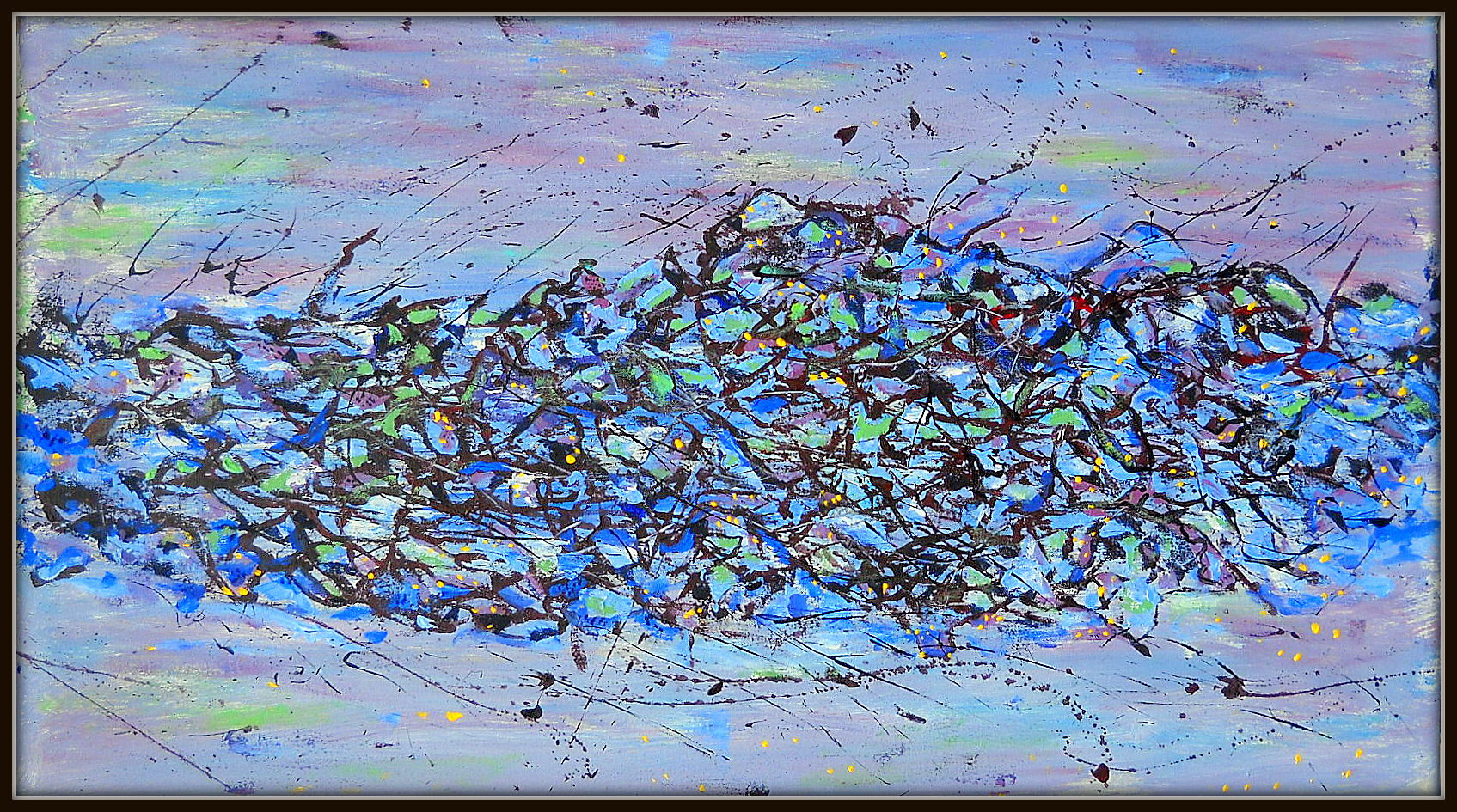
Black Rain. 35×18 acrylic on canvas
View GALLERY HERE.
What is your favorite color, someone asked–having in mind fabrics we were about to wrap ourselves in for a dress up show off and dance on the roof of the Ox…
An impossible question, I said. Every color is what it is only by the colors around it. Ask me, what combinations I’d like.
They didn’t believe me. Thought I was… I don’t know. But it’s true. We don’t know color as pure gradations on the spectrum of light, but in consort, in harmony with their surroundings. Place a tile of a particular chroma, change the surrounding colors, and–it’s as though transformed. Another color.
Add to that, that we don’t deal with color as primary light, but through the medium of pigments. I remember someone–probly on Facebook–showing his whatever… claimed that no one needs more than 5 tubes of pigment: blue yellow red black and white.
Sure. All other colors are variants of the primary colors. But pigments don’t give us color as pure light, but colors as rejections of parts of the spectrum. What appears as blue, is because the pigment absorbs reds and yellows and reflects, that is, casts off what we see–which is blue. And mixing pigments involves so many more variables.
Cut to the chase. When I want blue… there is no such thing as pure blue–but only the variants from chemical compounds–and they will all have different properties when we mix them with other pigments. Blue and yellow make green, so we know… but Ultramarine (PB-29… the standard way pigments are classified.. so you know what you’re really getting), makes a very different green than PB-28. Add to that, different pigments vary in opacity/transparency, in tinting strength.)
So what each artist chooses for their pallet will vary. Here is mine. What is yours?
Blue
PB – 15 Phthalo (or 15-2)
PB-28 Cobalt
PB-29 Ultramarine
PB-35 Cerulean
Yellow
PY-35 Cadmium
PY-38 Quinacridone
RED
PR-83 Alizarin Crimson
PR-101 Burnt Siena
PR-108 Cadmium Red
Orange
PO-20 Cadmium
Violet
PV-15 Ultra Marine
PV-19 Quinacridone
Green
PG-7 Thalo/Hookers Green
G-17 Chromium Oxide
Earth
PBr-6 Iron Oxide
PBr-7 Burnt Umber
…and I’m only dealing with acrylics. With oils, you have to factor in the varying expansion/contraction rates on drying unless what you put on is all one layer. Else your paint might crack and flake and fall off your canvas.
View GALLERY HERE.

Here it is. What do you think? Hope I didn’t do too much. 35×22″ Acrylic on canvas

Laying the ground. Critical decisions to make. Leave ‘unfinished’, with minimal reworking, or continue to something closer to my original impulse? I don’t follow through on initial ideas, in painting any more than in my writing. The first brush stroke, the first word, and a dialog begins. I never know where the conversation will lead.
View GALLERY HERE.
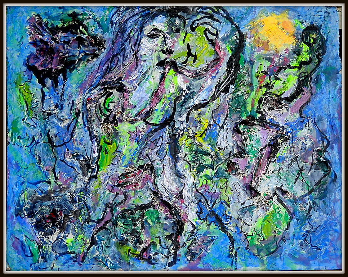
#400 25×33″ Acrylic, canvas strips, paper on Masonite. Photo misses the 3 dimensional–curving delineation is from pieces that were left stuck on the surface when I ripped off stuffed rolls of paper and fabric from an earlier piece (#134 “Late Capitalism”)–like fat bloody infected intestines. The ‘face’ is from those fragments.The “Chagalesque” character was not intentional, and definitely not something I’ll pursue in the future. But what the fuck, I like the colors.
View GALLERY HERE.

This is stage 2. Finished piece below.
#397 32×28 Stage 2 ? … or finished?
comparison with earlier stage is distorted, because the first photo was in the basement, not in full daylight. But I like the starker contrast. I darkened the tree and field background … leave it alone now. see below
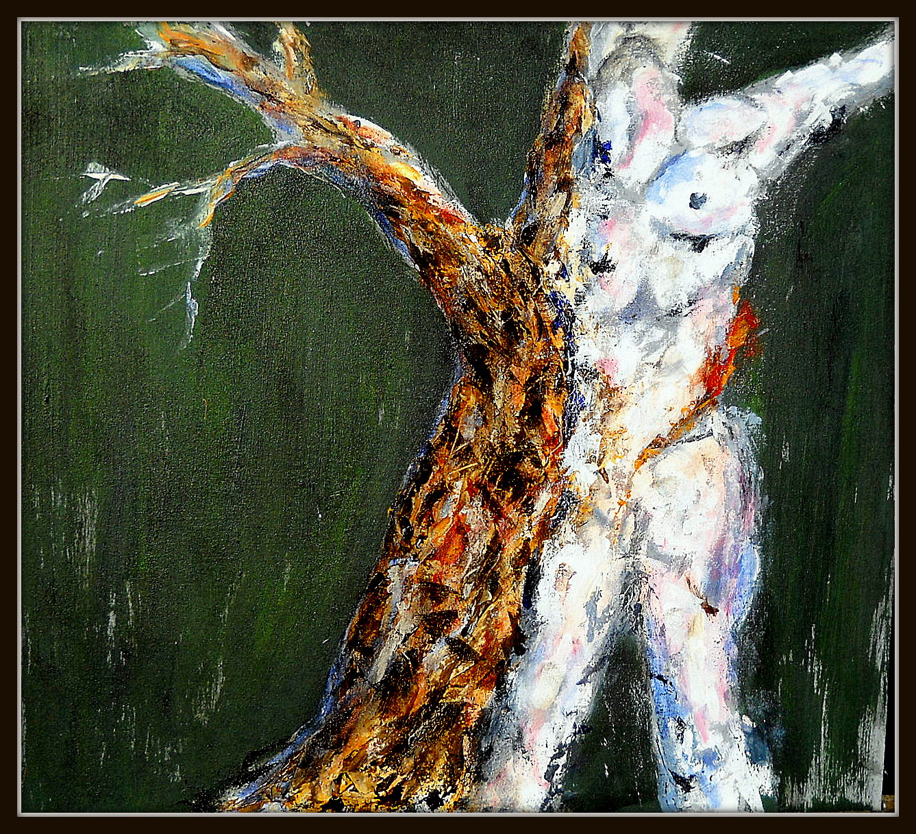

32×23 Acrylic on canvas. Go through the same stages. The first, as here–shows promise. Almost enough to let it stand, as is…but not quite. The next stage, I ruin it. Put it away. Sleep on it. In a dream, or while taking a walk, I get a sense of what I need to do. The third stage–I rescue it… bring it to completion… or really do ruin it. Prepare the canvas to paint over it and start a new painting.
What will become of this one?
View GALLERY HERE.