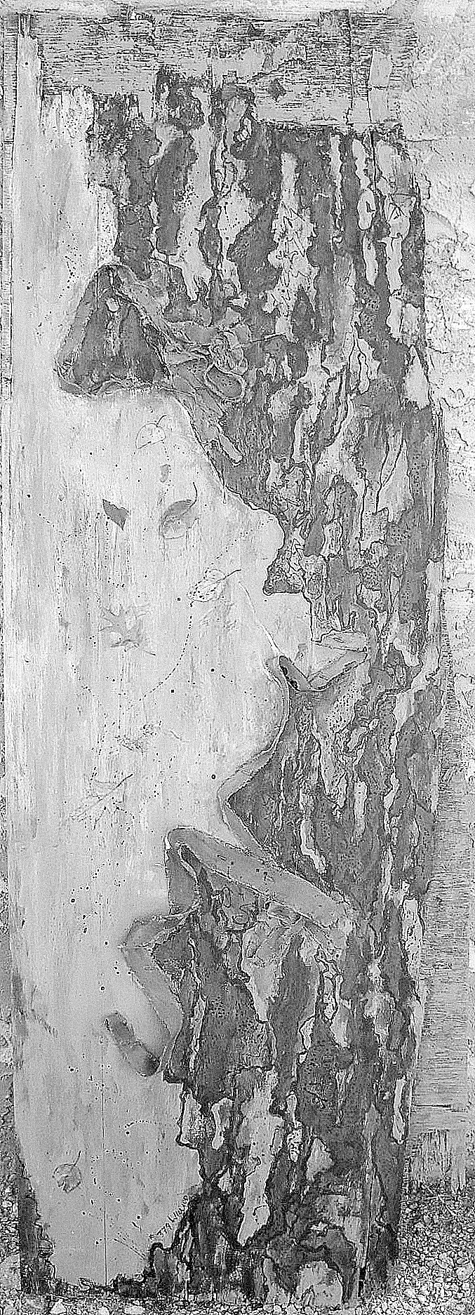
I’m posting this in B&W, as well as color, because working with intense color, tonal contrast can be a problem, as hues of equal tone can give an appearance of tonal contrast: warm hues, like yellow, will spring forward while cooler tones will recede–something you can clearly see when you compare these. When I look at the monotone photo, I think that I might like to have made those blues even darker. One can have strong intuitive sense of color expression, but there’s no substitute for knowledge of color theory. This has been a weak point in some of my pieces, so I’m pleased with the how this holds up in monotone–it would make an interesting etching!
66×23″ Acrylic on weathered plywood, with leaves (I think I was channeling my Saturday morning “Trees of Fairmount Park field trip for this). I used strips trimmed from stretched canvases to define the borders.


View GALLERY HERE.
